This Is Not an Image
What you see is a photograph reproduced with a single CSS property: box-shadow. A Node.js script reads the image pixel by pixel, and each colour becomes the shadow of a 1x1 div. The result is a CSS file thousands of lines long that paints the entire photo with no image at all. A new format? Maybe. Useful? Not at all. But the effects it produces cannot be achieved with any JPG in the world.
An experiment where we turned a real photograph into pure CSS code, pixel by pixel, and discovered that the box-shadow property hides a full drawing engine. Not practical, but it opens the door to visual effects no conventional image format can offer.
- Node.js + Jimp: pixel-by-pixel reading and automatic conversion to CSS box-shadow
- Four variables (distance, blur, spread, origin) that transform the photo from realistic to abstract
- A multi-megabyte CSS file to paint a photo: the least efficient image format in history
The idea
Look at the image below. Now, try to right-click and save it. You cannot. Because it is not an image: it is the shadow of a single pixel.
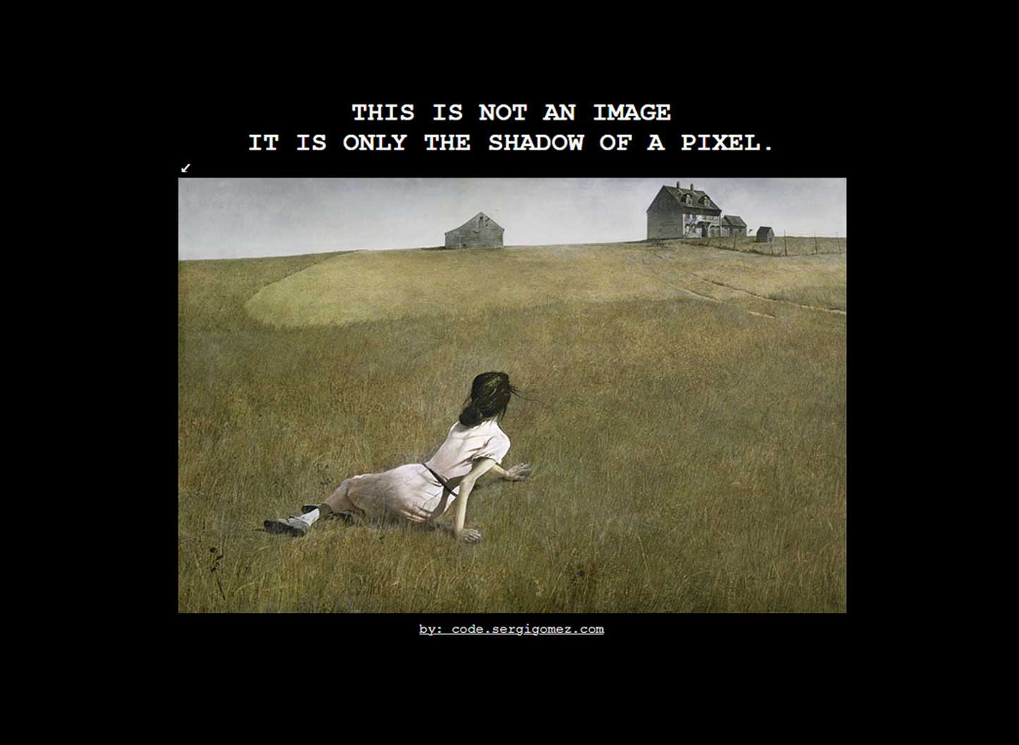
The experiment starts with an absurd question: can you reproduce a real photograph using nothing but the CSS box-shadow property? The answer is yes. And the result is a single line of CSS code with tens of thousands of shadows, each one representing a pixel from the original photo.
How it works
The tool is a Node.js script that uses a library called Jimp to read an image pixel by pixel. For each pixel, it extracts the colour (red, green, blue and transparency) and converts it into a CSS shadow positioned exactly where it belongs.
The starting point is a 1x1 pixel div. A single dot on screen. From there, the script generates a box-shadow property with as many shadows as the image has pixels. Each shadow carries the exact colour of the original pixel and is placed at its coordinate.
The result is a CSS file with a single class and a single property. Technically, it is an image encoded as code. A "new image format", if you want to be generous with the definition.
The four variables that change everything
This is where the experiment gets interesting. The script has four parameters that completely transform the visual output. By tweaking them, the same photo can go from faithful reproduction to total abstraction.
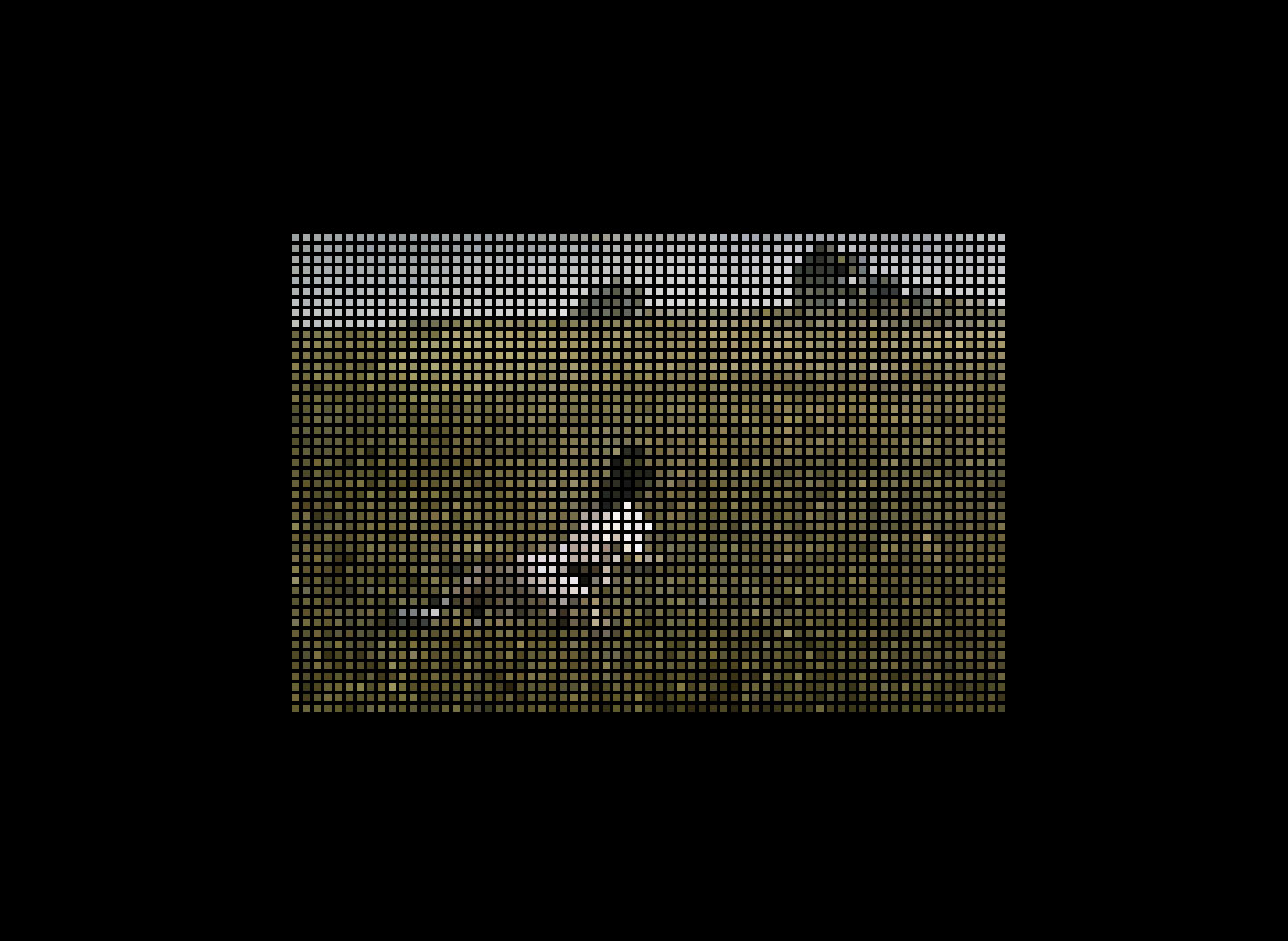
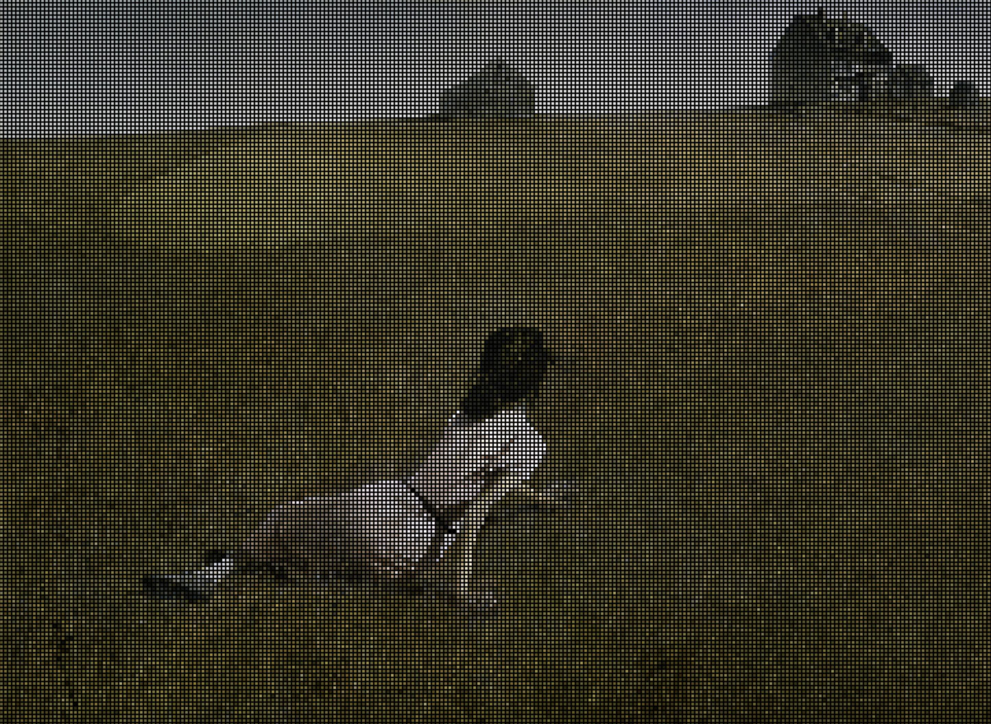
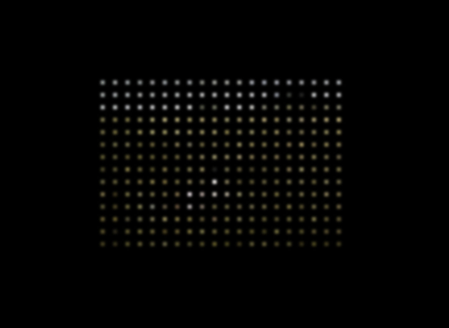
Pixel distance
Controls the horizontal and vertical spacing between each shadow. At value 1, the image is reconstructed faithfully. Increase the distance and grids, mosaics and visible patterns appear.
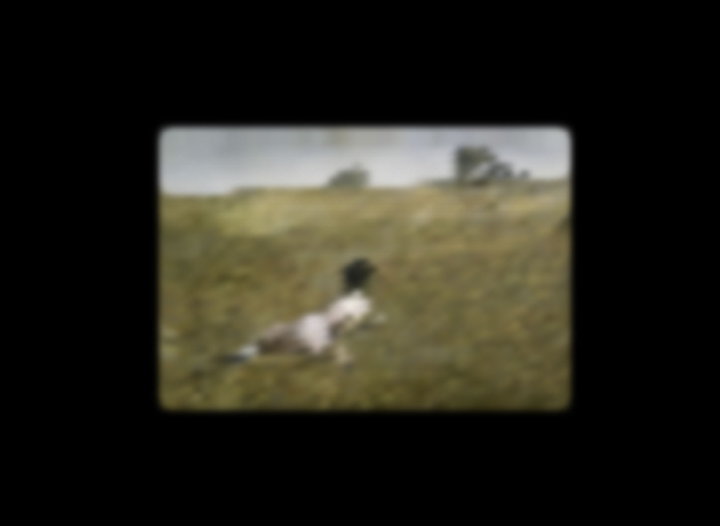
Blur
Applies blur to each individual shadow. At zero, the image is sharp pixel by pixel. Increase the value and the photo transforms into a blurry version, like a memory seen through frosted glass.
Spread
Controls the size of each shadow. With low spread and high distance, you get colour dots floating on a black background, like a constellation.
Origin point
The script can generate shadows from the centre, from any corner or from an arbitrary point. Changing the origin changes how the image "unfolds" visually, as if you were opening it from a different spot.
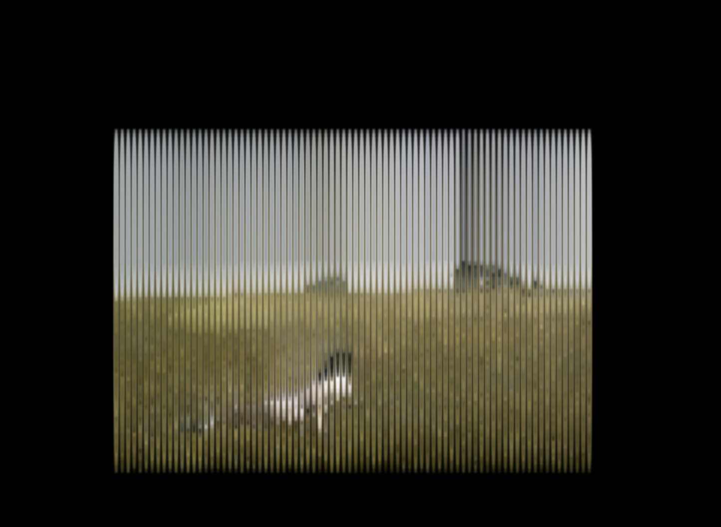
The curtain effect
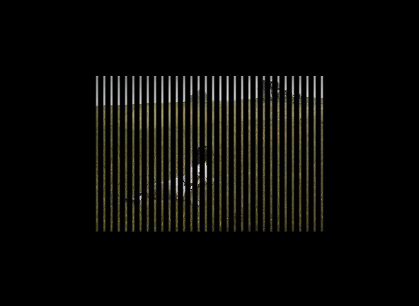
Combining minimal vertical distance with high horizontal distance (or vice versa) produces line effects that recall Venetian blinds or the strings of a harp. In the image below, the same pixel that generates the photo creates vertical bars that let the original image show through.

When the line density is very high, the image nearly disappears, as if viewed through a metal grille.
The weight of the "new format"
Let us be honest: the resulting CSS is enormous. A 400x266 pixel image (half the original resolution) produces a CSS file several megabytes in size. For the browser, rendering tens of thousands of shadows is expensive, and it shows.
This is not a format to replace JPG. Not even close. But the beauty is that what you lose in efficiency you gain in creative control. Each shadow is an independent CSS element, which means you can animate them with transitions, change colours, apply filters, create sequences. Things you simply cannot do with a normal image.
What it is for (and what it is not)
Not for: loading photos on a production website, replacing image formats, or anything that requires the browser not to struggle.
Good for: generative art, digital installations, unique visual effects and exploring how far a CSS property can go when we normally use it to put a gentle shadow under a button.
The full code is on GitHub for anyone who wants to experiment.
An experiment that starts with an absurd question and ends up revealing that
box-shadow, the property we use to decorate buttons, hides a full drawing engine. Not practical, but one of those things that helps you understand how things really work under the hood.